
A look into the new features of ARCx Analytics
At ARCx we're committed to building the best end-to-end Analytics platform for Web3; we understand the pain of using multiple sources to gain insight into your users, and with the lack of tools linking Website data with on-chain date, insights currently need to be improved. So today, we're excited to release the next version of ARCx Analytics.
Introducing ARCx Analytics V4, the latest version with improved features that will enable you to improve conversion, increase retention and engage more users. So, let's take a look at the new features we have implemented.

We've added three new filters you can apply: the 'Web page' filter, the ‘button’ filter and the 'Blockchain' filter. Now, you can quickly analyze the performance of specific web pages and the the buttons that your users click. Additionally, you can understand which blockchains your users are spending their time on. By applying multiple combinations of filters you can gain a deeper understanding of your users, which will help you make more informed decisions.
For example, on the ‘Wallets Overview’ tab, you can use the ‘first seen’ filter along with sorting the table by lowest number of transactions; to identify wallets who have recently visited your app but not made transactions. Then you can take these addresses to the ‘Wallet Journey’ tab to see exactly where they are churning.
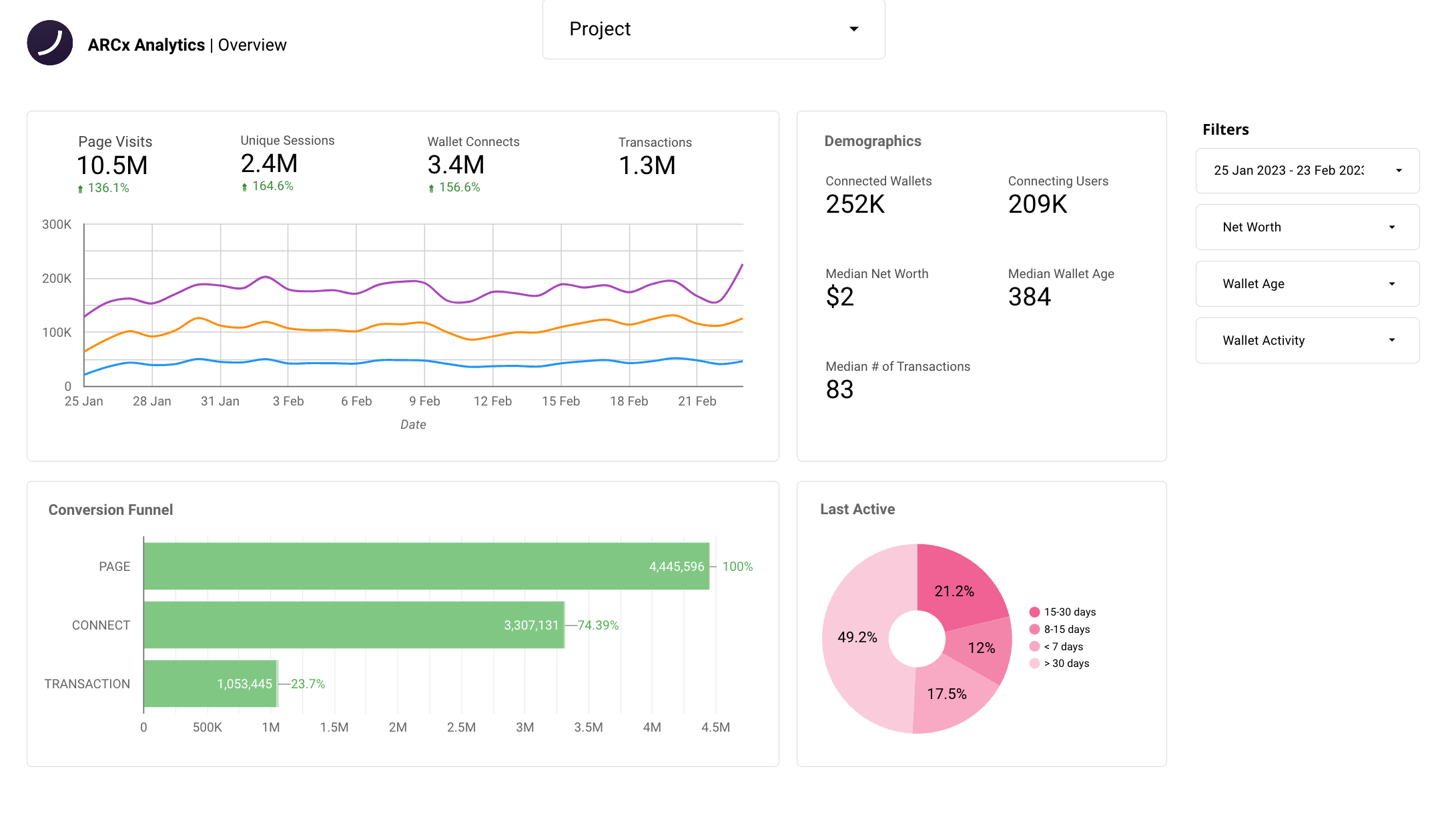
We've overhauled the overview tab to give you a more comprehensive view of the critical metrics to track day-to-day. For example, you now have a more detailed conversion funnel; you can see page visits, wallet connects, and transactions over time. In addition, a new widget has been added that includes a demographic breakdown of your users. And remember, you can apply all filters to this tab to refine your insights.
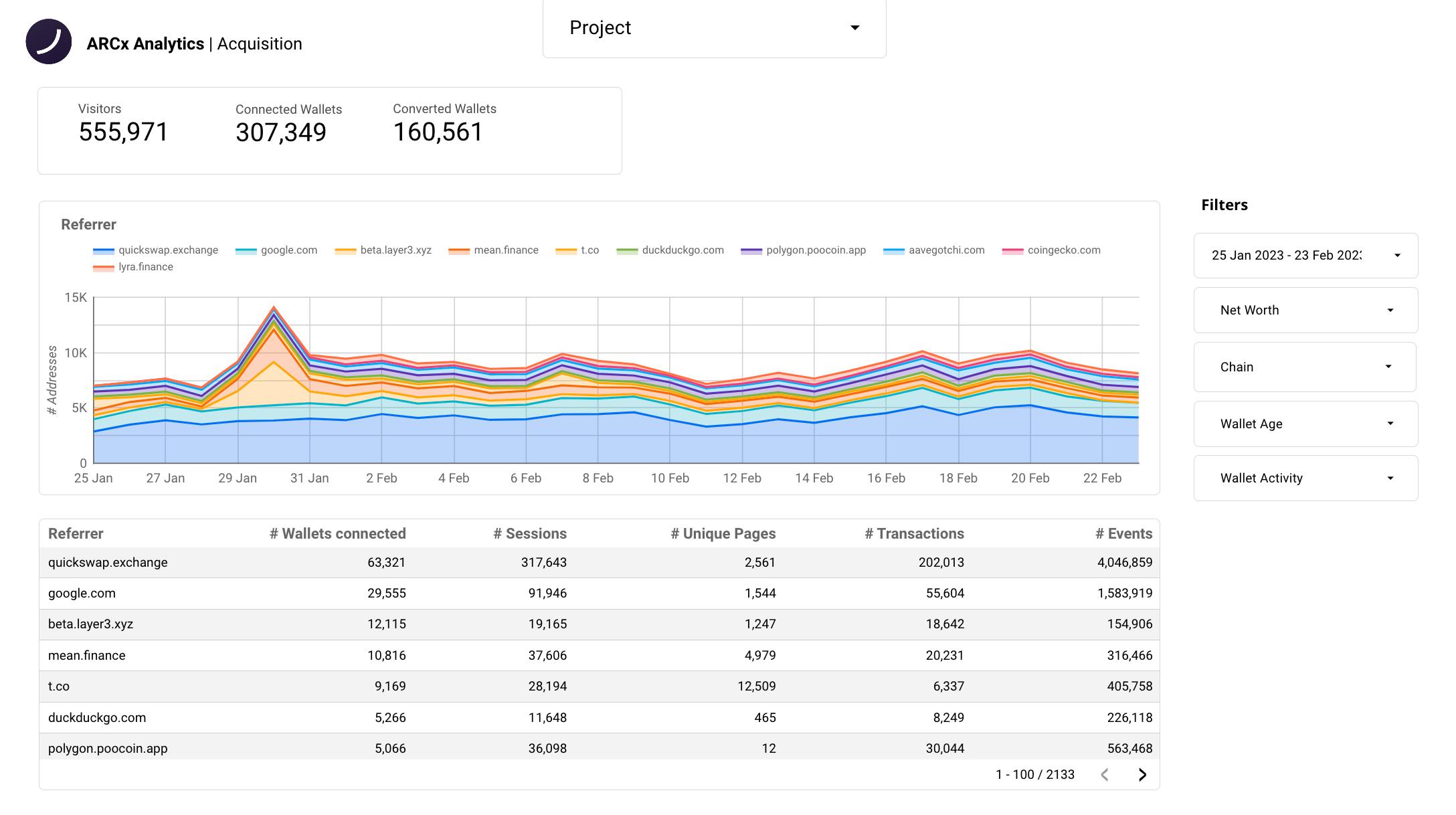
Introducing the all-new Acquisition tab; this is a powerful tool for tracking and measuring the success of your marketing campaigns. With this new tab, you can access essential metrics of your dApp, such as Visitors, Connected Wallets and Converted Wallets, giving you a comprehensive view of the user acquisition journey.
To help you dive even deeper into your data, we've also included the Referrer chart - which allow you to track where your users are coming from. Furthermore, we've added a table with a list of sources, that provides insight into where the wallet connects, sessions, unique pages, transactions and events have originated from.

In this view, you can also click on each source to filter the dashboard. So, for example, if you want to see all the visitors, wallets, connectors and transactors coming from Discord - click on DexScreener, and it'll filter the page to all your DesScreener data.
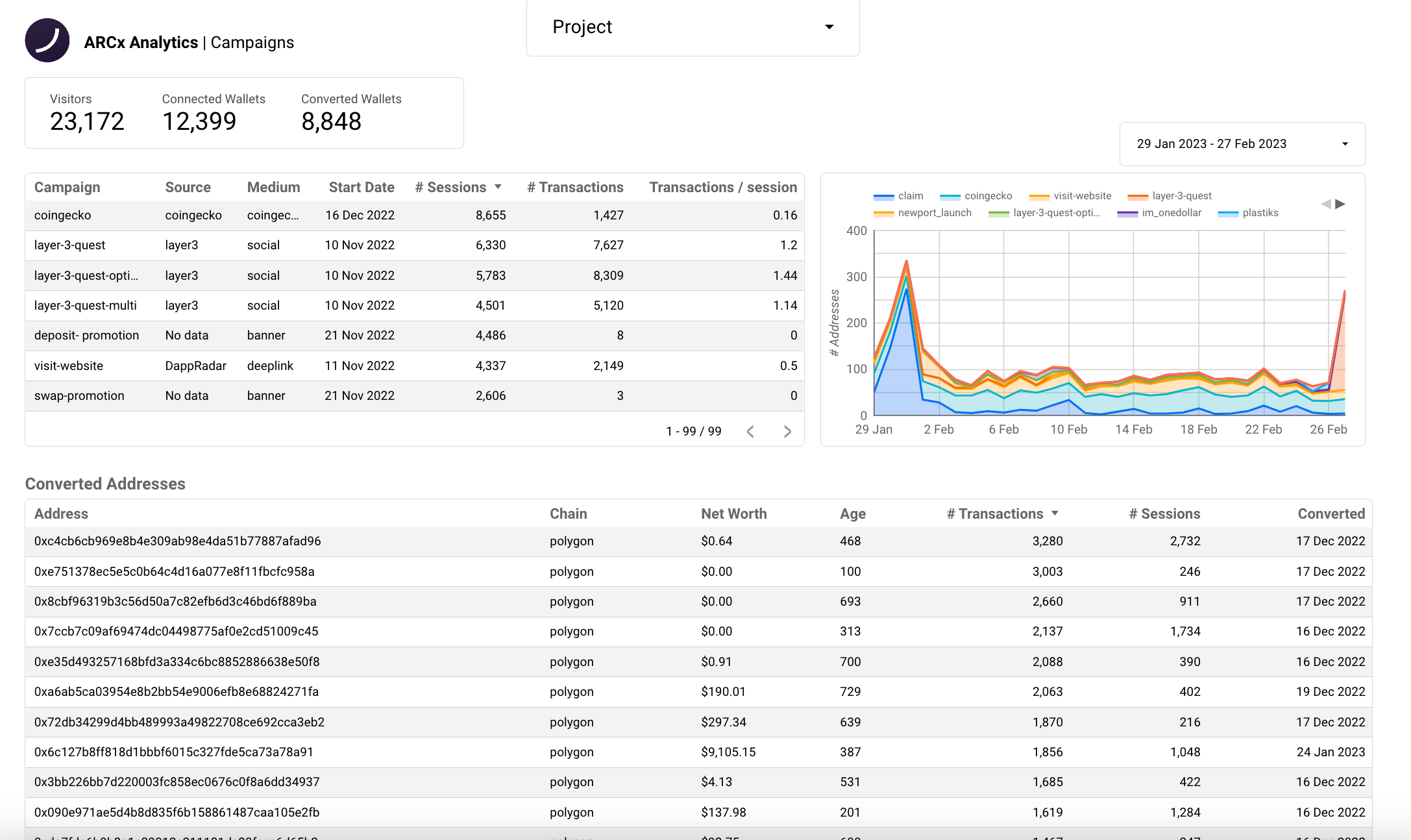
Another tab we added is 'campaigns'. This tab is the central place to view the effectiveness of your marketing campaigns. Here you can view campaign-specific metrics such as visitors, converted wallets and converted users, with a list of each campaign below that.
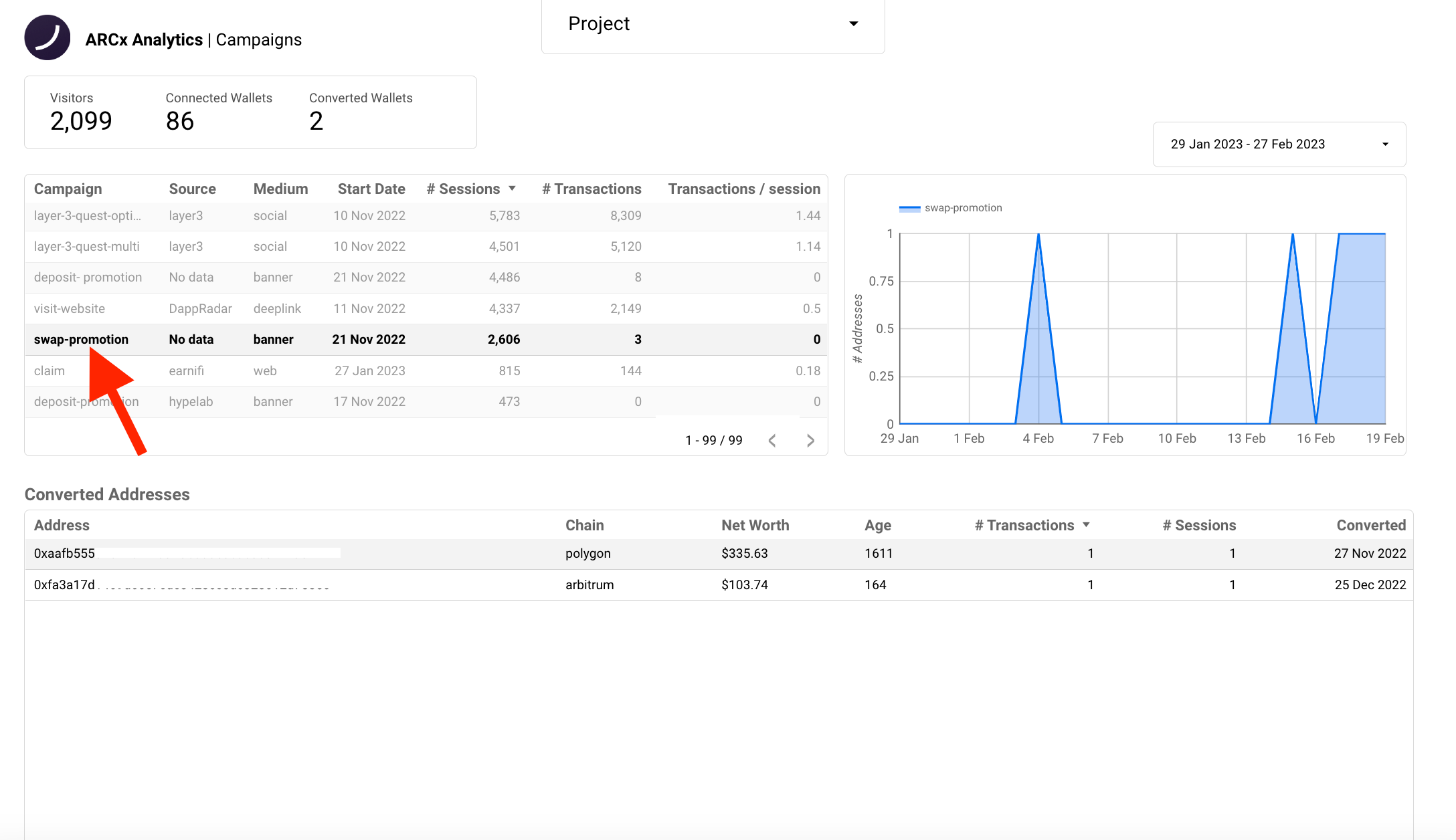
You can click on any campaign within the list, this will filter the data displayed specifically to that campaign. Below, we have path conversions (the number of paths it took users to convert) and converted addresses (a list of all converted addresses).
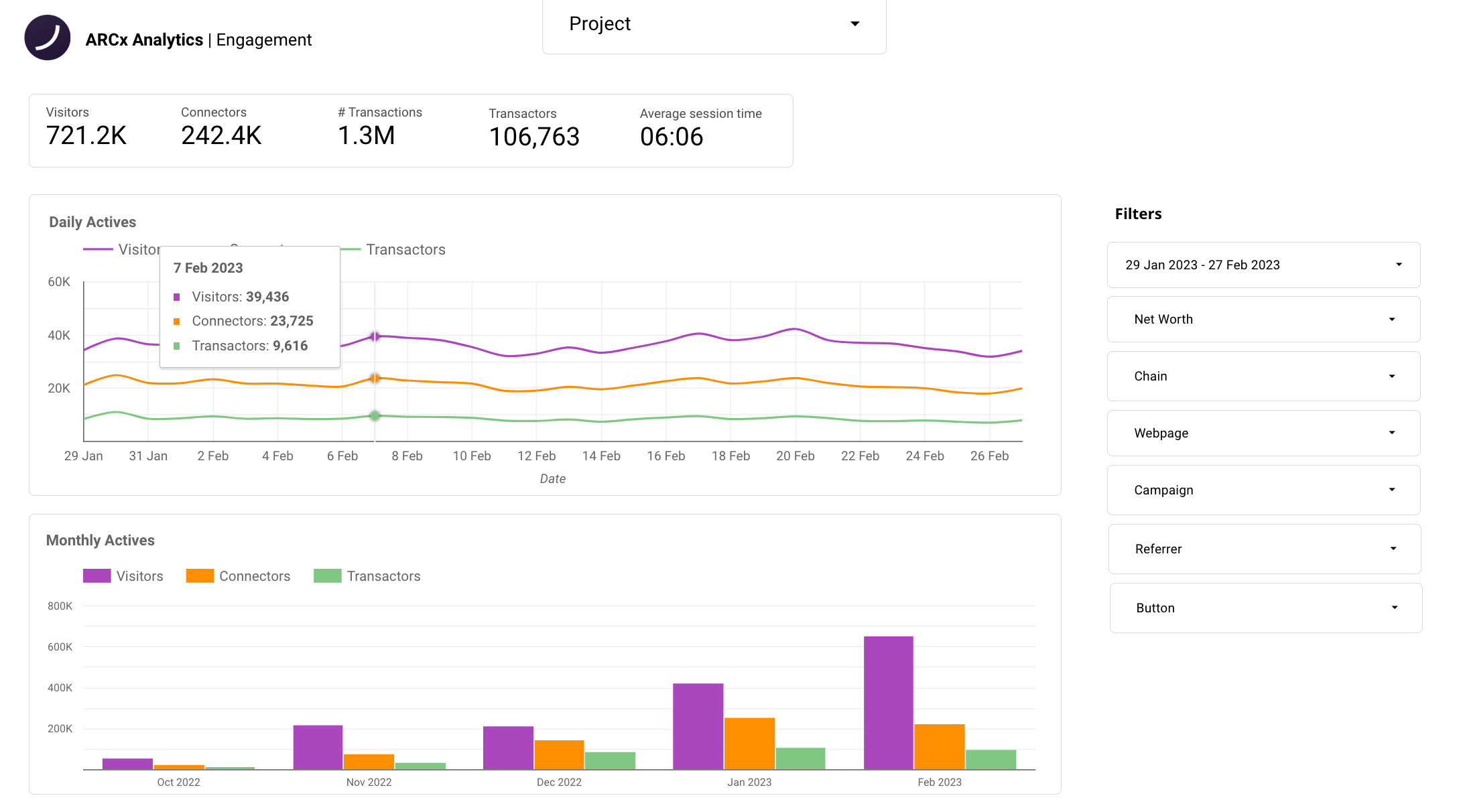
Next up is the new engagement tab. This tab provides a comprehensive view of the activity on your dApp, including a breakdown of visitors, connectors, and transactors. It displays the number of transactions and average session time. Using this tab, you'll be able to keep track of your active users over time, identify your most popular pages, and identify those that are not performing. In addition, we've added a new feature that allows you to see which buttons are clicked the most, providing a new way of identifying areas of improvement in the UX.
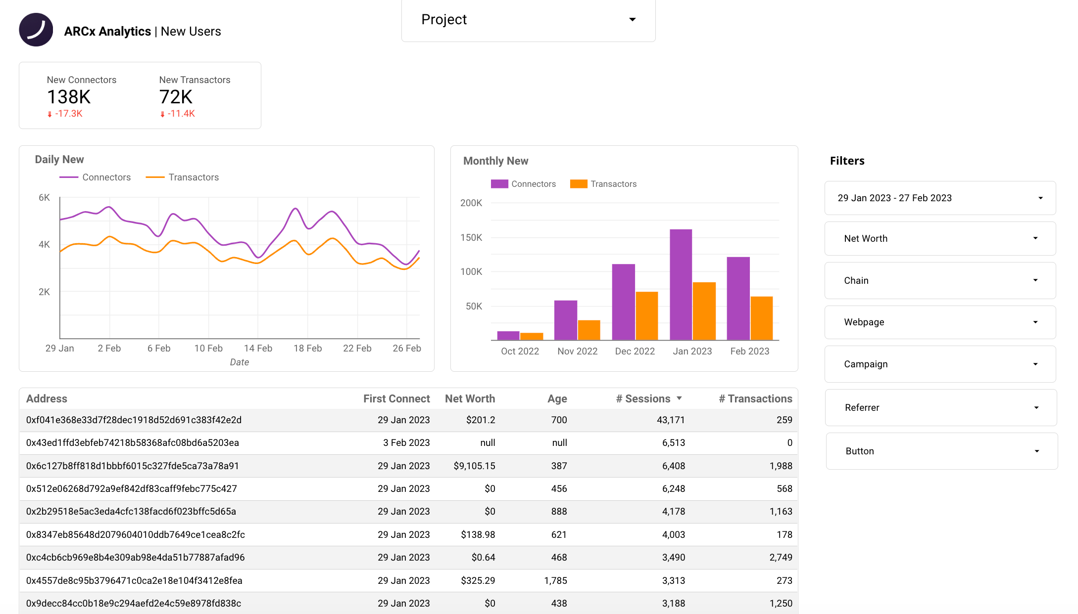
We have made further improvements to the New Users tab, providing you quick insight into the new connectors and transactors on your dApp. A better visualization of your daily and monthly new users and transactors is also shown. The table offers quick insight into their net worth, address age, number of sessions, transactions and shows the date they first connected.
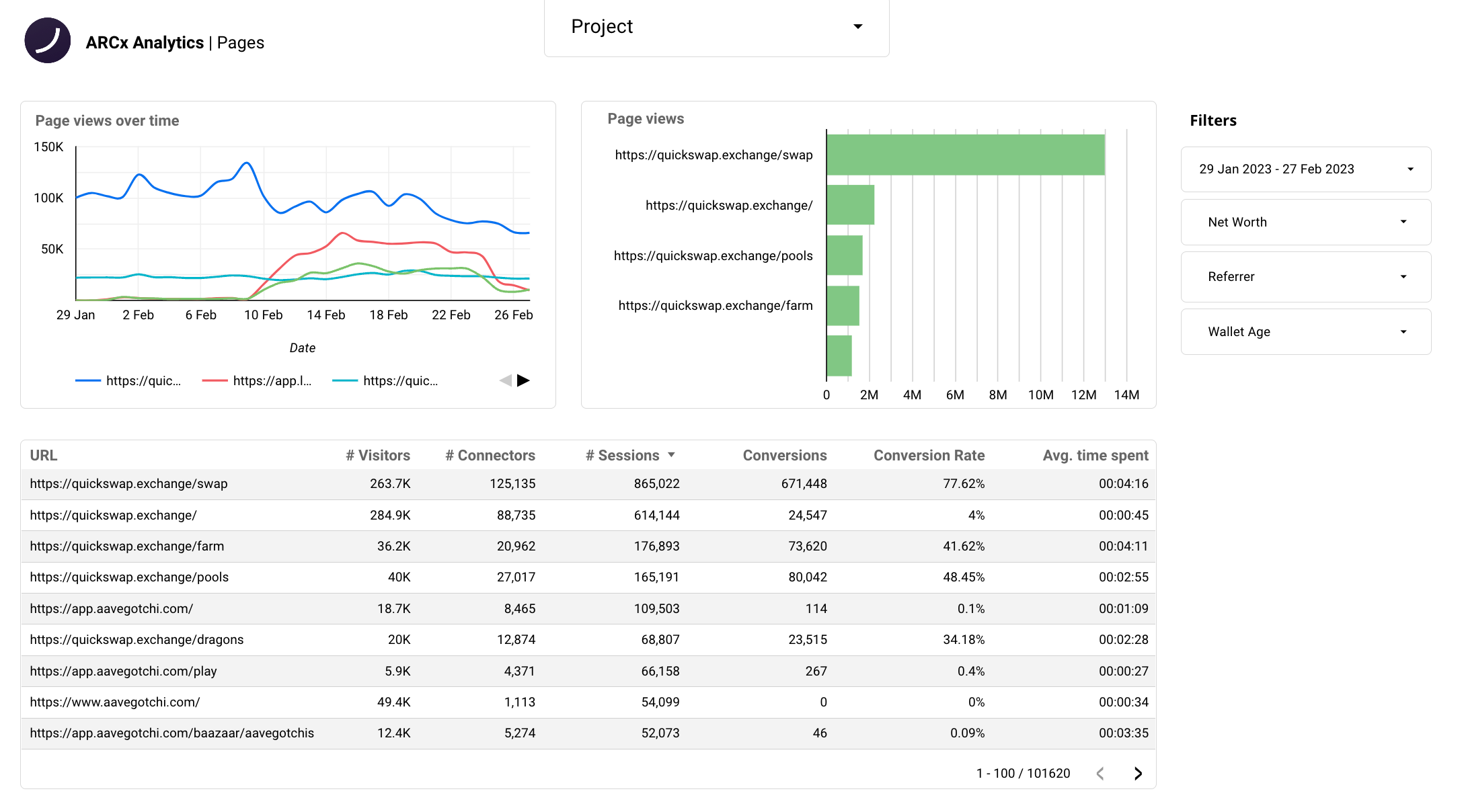
The 'Page' tab is next. We have added a new chart that displays your page views over time, as well as a visualization of the total page views for each individual page. We have also made improvements to the pages table. You can now view a breakdown of visitors and connectors for each page, as well as the conversion rate and number of conversions for each page, and the average time spent on each page. This allows you to easily track page views over time and identify your most popular pages, which may differ from what you expect. If you want more detailed information, you can click on a specific page in the table to view page-specific metrics.
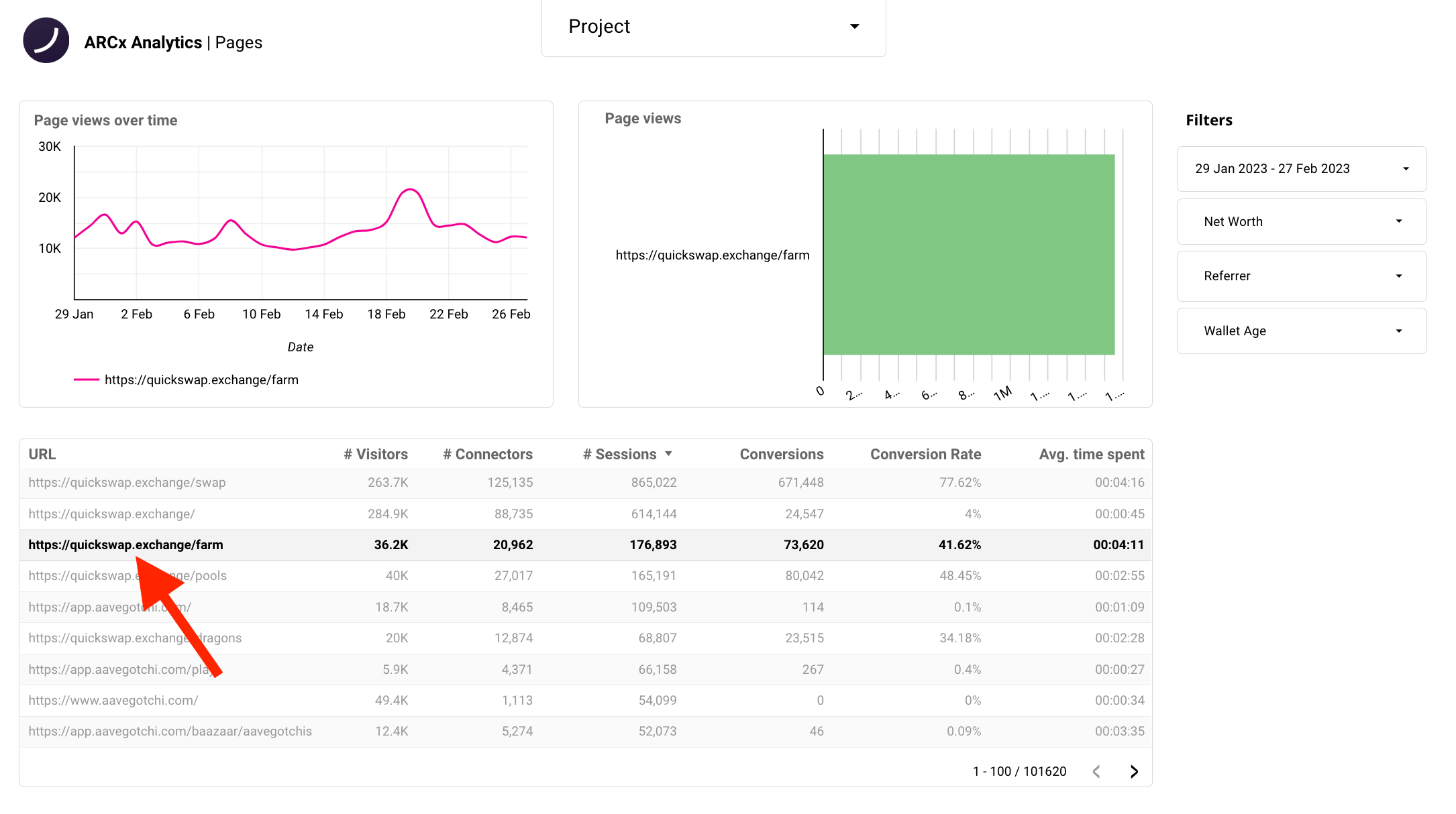
What's powerful about this page is the ability to filter by metrics such as net worth, referrer and wallet age. This gives you improved control over the insights you want to look for. For example, you could filter by net-worth to see how different user segments view your pages. In addition, you might identify underperforming pages, enabling you to improve these pages and ultimately increase conversion rates.
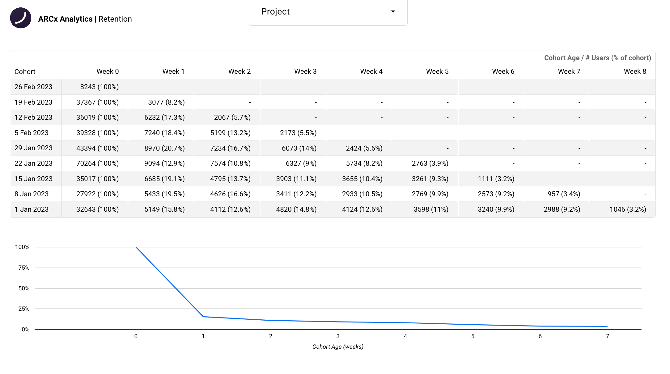
One of the most important metrics you should be measuring is retention; most Web3 projects often overlook this. So we make measuring this metric very accessible. With the addition of the retention chart at the bottom, you can easily see the retention of your users over time, whether that be to align your team or report back to investors.
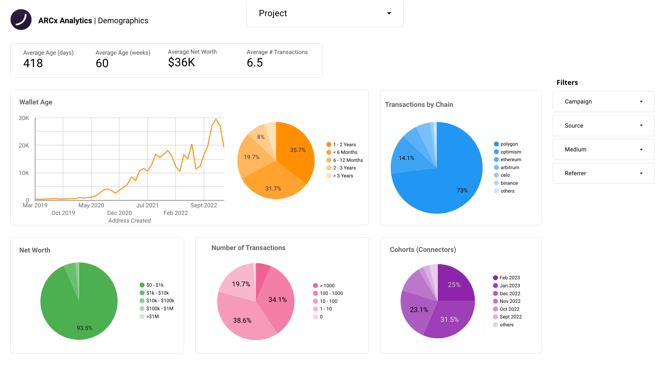
The Demographic Overview tab has been improved. Firstly, you can view the average age, net worth, and transactions of your user base. Then, you can see a breakdown of the wallet age of your user base. You can also see which chains they spend the most time on. Finally, you can view the different segments of net worths, transactions, and first connects that make up your user base.
This tab allows you to quickly gauge the experience of your users. This can help you determine if your dApp has bad actors who are engaging in airdrop farming. You can also identify the most popular chains among your user base or the most popular chains among your high net-worth users. If your dApp is not already deployed on those chains, consider deploying there to increase engagement.
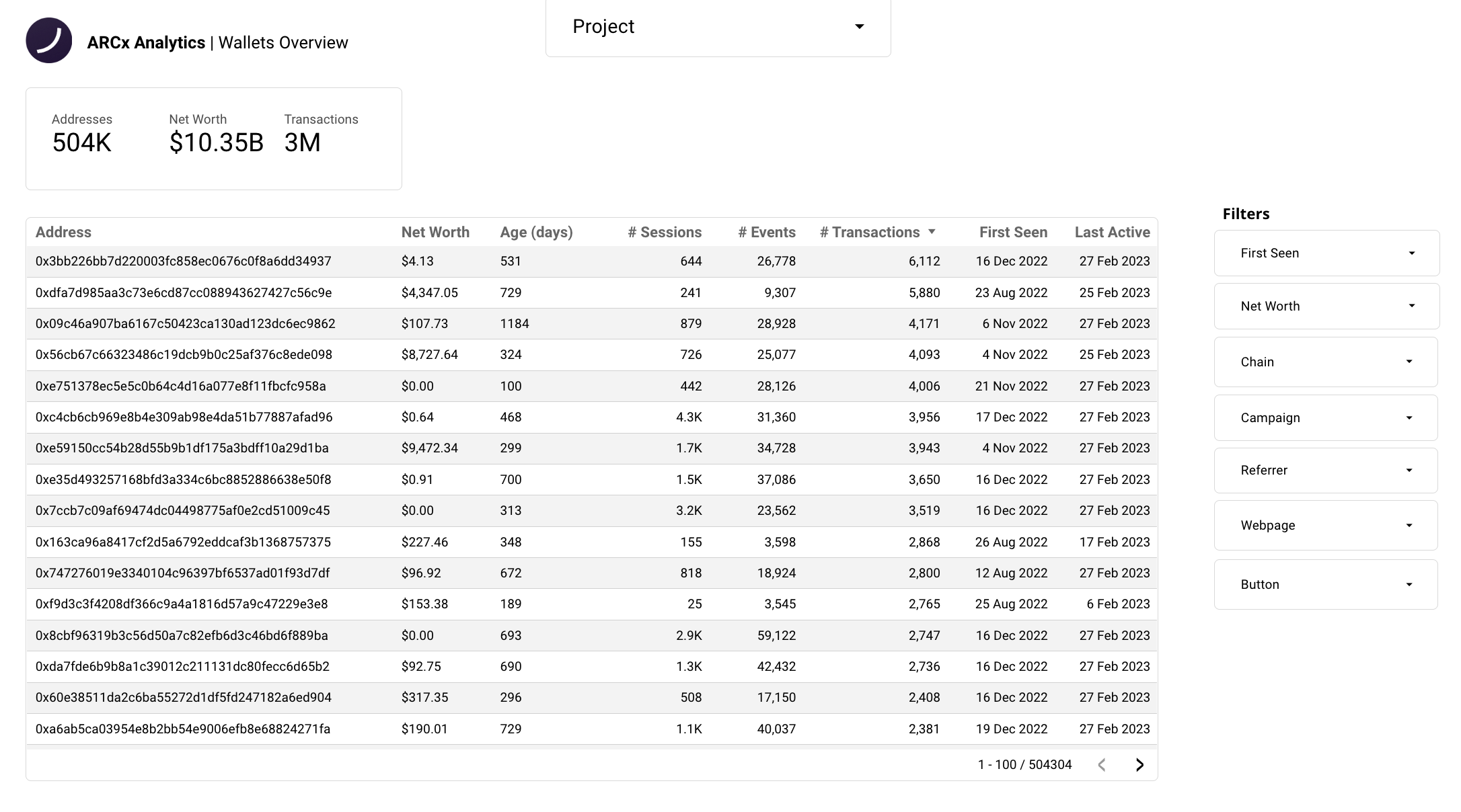
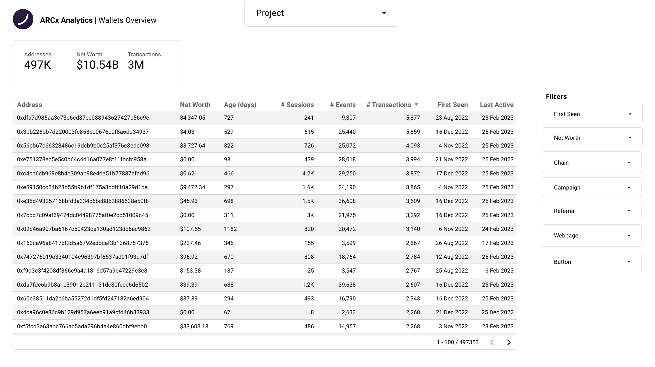
The wallet overview tab is essential for understanding your users. Here, you can see the exact number of addresses using your dApp, as well as the total net worth and number of transactions made by these addresses. You can sort the table by any metric, such as ‘net-worth’ to find the whales using your dApp, or by ’first seen’ to find your most recent users.
The powerful aspect of this page is the ability to filter by all the filters on the right-hand side. You can segment users into specific demographics to gain a better understanding of them. This can be particularly useful for identifying recent users from marketing campaigns or if your whales are making transactions.
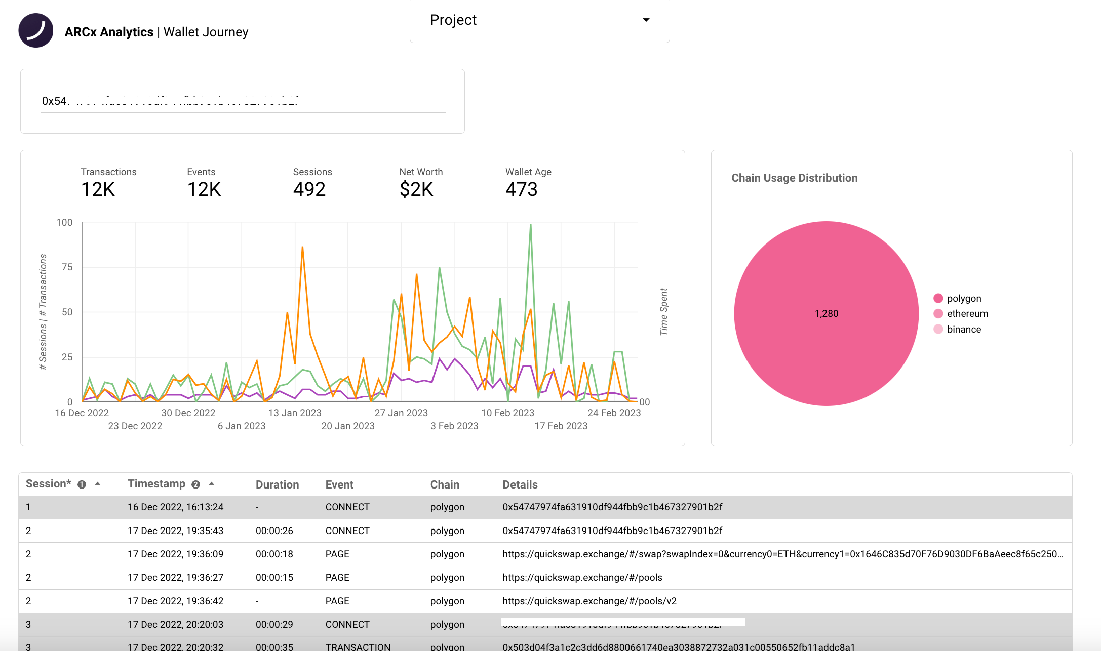
The 'Wallet Journey' tab allows you to search for individual wallet addresses and view detailed information about that address's activity on your dApp.
The tab displays the wallets number of transactions, events, and sessions, along with their net-worth and the wallet age. In addition, the tab includes a chart with a breakdown of the sessions, transactions, and time spent over the address's lifetime on your app. This chart provides a comprehensive view of the user's behaviour on your app, allowing you to identify trends and patterns in their activity.
So if you've ever had trouble pinpointing bottlenecks in the UX, this tab is for you. You can view the exact journey wallets take through your dApp. You'll be able to see all the events the address has made, the length of these events, and details like time stamps and chain. This makes it easy to track the user's journey through your dApp, allowing you to identify areas of difficulty and make improvements.
In summary, ARCx Analytics V4 represents a significant improvement over V3. It provides new insights and strategies that can help boost conversion, retention, and user engagement. Additionally, it enables you to enhance the user experience and deliver even more value to the end user.
This was just a brief overview of the new dashboard. In upcoming articles, we'll delve into all the ways you can use these tools to take your project to the next level. So, if you're ready to elevate your project, sign up for ARCx Analytics below.
SHARE ON

.svg)
.svg)


